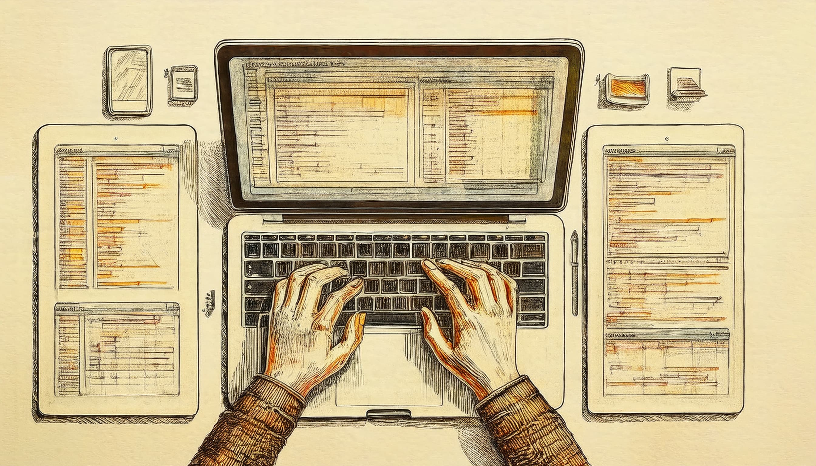
Responsive Layouts & Advanced CSS Techniques
Adapting design for every device using flexbox, grid, and media queries
I am an aspiring web developer on a mission to kick down the door into tech. Join me as I take the essential steps toward this goal and hopefully inspire others to do the same!
Introduction
In today’s diverse digital landscape, designing for multiple screen sizes and devices isn’t just a luxury—it’s a necessity. Responsive layouts ensure that a website looks great and functions well on everything from small smartphones to large desktop monitors. In this article, we will dive into advanced CSS techniques that not only help us to build responsive layouts but also enhance accessibility and legibility. We’ll cover:
Flexbox and Grid: Powerful layout models that simplify complex designs.
Media Queries: Creating breakpoints to adapt our design to different viewports.
Advanced CSS Techniques: Enhancing typography, spacing, and color contrast for a more accessible experience.
Understanding Responsive Design
Responsive design means creating layouts that automatically adjust to fit the screen size of the user’s device. The goal is to ensure a seamless and intuitive experience no matter how a website is viewed. This is achieved by using flexible grids, images, and CSS media queries.
Advanced Layout Models: Flexbox and Grid
Flexbox
Flexbox is designed for one-dimensional layouts. It allows developers to align and distribute space among items in a container, even when their size is unknown or dynamic.
Key Concepts:
Flexible Containers: Use
display: flexto initiate a flex container.Alignment: Properties like
justify-contentandalign-itemshelp center or space items evenly.Direction: Control the layout direction with
flex-direction.
Example:
.flex-container {
  display: flex;
  flex-direction: row;
  justify-content: space-between;
  align-items: center;
  gap: 1rem;
}
Let's see Flexbox in action with a practical navigation menu example. This responsive navigation transforms from a mobile-friendly hamburger menu to a horizontal navbar on larger screens. Try resizing your browser window to see how seamlessly it adapts to different viewport widths. Notice how just a few Flexbox properties create a completely different layout experience depending on the device.
Grid
CSS Grid is a two-dimensional layout system that offers a grid-based layout system with rows and columns. It’s ideal for complex layouts.
Key Concepts:
Grid Container: Set
display: gridto create a grid container.Grid Template: Define rows and columns using
grid-template-columnsandgrid-template-rows.Gap: Use
grid-gapor simplygapto add spacing between grid items.
Grid layouts shine when creating complex, image-based interfaces. This photo gallery demonstrates the power of CSS Grid to create visually interesting layouts that automatically adapt to any screen size. The 'featured' images span multiple grid cells on larger screens but collapse into a clean single-column layout on mobile devices. Hover over each image to see additional interactive elements appearing smoothly.
Example:
.grid-container {
  display: grid;
  grid-template-columns: repeat(auto-fit, minmax(250px, 1fr));
  gap: 1rem;
}
Media Queries: Adapting to Different Viewports
Media queries allow us to apply CSS rules based on conditions like viewport width, height, and even device orientation.
Example:
/* Default styles for mobile-first design */
.container {
  padding: 1rem;
}

/* For screens wider than 600px */
@media (min-width: 600px) {
  .container {
    padding: 2rem;
  }
}

/* For screens wider than 1024px */
@media (min-width: 1024px) {
  .container {
    padding: 3rem;
  }
}
Using media queries effectively means planning our breakpoints based on the content rather than arbitrary device sizes. This way, the design adapts naturally to the available space.
Media queries are the backbone of responsive design. This interactive example lets you see exactly when and how different design elements respond to changing viewport sizes. Watch as colors, layouts, and typography transform at each breakpoint—all while the current viewport width is displayed in real-time. This demonstrates how we can create completely different experiences for mobile, tablet, and desktop users with the same HTML.
Enhancing Accessibility with Advanced CSS
Color Contrast and Readability
Good design is accessible design. Ensuring sufficient color contrast is critical for users with visual impairments. Use tools like the WebAIM Contrast Checker to verify that text and background colors meet WCAG guidelines.
body {
  background-color: #ffffff;
  color: #333333;
}
Focus Styles for Keyboard Navigation
Clearly visible focus styles help keyboard users understand which element is active. Customize focus outlines to fit the design while remaining prominent.
a:focus, button:focus, input:focus {
  outline: 3px solid #FFD700; /* A bright, visible gold outline */
  outline-offset: 2px;
}
Accessibility isn't just about screen readers—it's also about keyboard navigation. This example demonstrates the critical importance of proper focus styles for interactive elements. Use your Tab key to navigate through the different examples and see the stark contrast between poor focus indicators (invisible or low-contrast) and accessible ones. Remember that many users rely entirely on keyboard navigation, making these visual cues essential.
Managing Typography and Spacing for Legibility
Typography and spacing are key to readability. Using relative units like em and rem ensures that text scales based on user preferences. Consistent spacing and padding help create a visually harmonious layout that’s easier on the eyes.
Example:
body {
  font-size: 16px; /* Base font size */
  line-height: 1.6;
  margin: 0;
  padding: 0;
}

h1, h2, h3 {
  margin-bottom: 0.5em;
}

p {
  margin-bottom: 1em;
}
Using CSS custom properties (variables) can help maintain consistency across a design:
:root {
  --primary-color: #007BFF;
  --secondary-color: #333333;
  --base-font-size: 16px;
}

body {
  font-size: var(--base-font-size);
  color: var(--secondary-color);
}
Real-World Example: A Responsive Web Layout
Let’s put it all together with a sample layout that uses Flexbox, Grid, and media queries.
<!DOCTYPE html>
<html lang="en">
<head>
<meta charset="UTF-8">
<title>Responsive Web Layout</title>
<link rel="stylesheet" href="styles.css">
</head>
<body>
<header class="flex-container">
<h1>My Responsive Site</h1>
<nav>
<ul class="flex-container">
<li><a href="#home">Home</a></li>
<li><a href="#about">About</a></li>
<li><a href="#services">Services</a></li>
</ul>
</nav>
</header>
<main class="grid-container">
<article>
<h2>Welcome</h2>
<p>This is a sample responsive layout using advanced CSS techniques.</p>
</article>
<article>
<h2>Our Work</h2>
<p>We build accessible and responsive websites that adapt to any device.</p>
</article>
<article>
<h2>Contact Us</h2>
<p>Get in touch with us for more information.</p>
</article>
</main>
<footer>
<p>© 2025 My Responsive Site. All rights reserved.</p>
</footer>
</body>
</html>
And the accompanying CSS (styles.css):
/* Base Styles */
body {
  font-family: Arial, sans-serif;
  margin: 0;
  padding: 0;
  background-color: #ffffff;
  color: #333333;
}

header, nav, main, footer {
  padding: 1rem;
}

/* Flexbox for Header */
.flex-container {
  display: flex;
  flex-direction: row;
  align-items: center;
  justify-content: space-between;
  gap: 1rem;
}

/* Responsive Grid for Main Content */
.grid-container {
  display: grid;
  grid-template-columns: repeat(auto-fit, minmax(250px, 1fr));
  gap: 1rem;
  padding: 1rem;
}

/* Media Queries */
@media (min-width: 600px) {
  body {
    font-size: 18px;
  }
}

@media (min-width: 1024px) {
  body {
    font-size: 20px;
  }
}

/* Focus Styles */
a:focus, button:focus, input:focus {
  outline: 3px solid #FFD700;
  outline-offset: 2px;
}
This example demonstrates a responsive header using Flexbox, a main content area using CSS Grid, and adjustments for typography via media queries.
Conclusion
Responsive design is essential for delivering a seamless user experience across devices. By combining advanced CSS techniques like Flexbox, Grid, and media queries, we can create layouts that are both visually stunning and accessible. Remember, a truly accessible design pays attention to color contrast, focus visibility, and readable typography. Embrace these techniques to build responsive, advanced web layouts that work for everyone.